GTOPS Impact Dashboard
I built a Next.js dashboard that turns Coursera learner activity and program metrics into clear public reporting for GTOPS / EC4A, with Supabase storage, historical CSV backfill, and a live xAPI receiver for new activity.
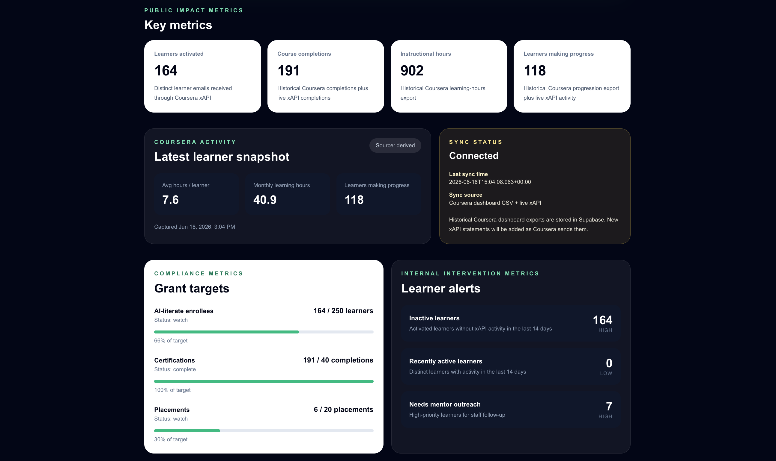
Live dashboard: https://gtops-dashboard.vercel.app/
The problem
GTOPS / EC4A needed a clearer way to show the impact of its Coursera-based digital skills programs. The useful information was spread across Coursera reports, historical exports, grant goals, and program planning conversations. That made it harder to answer simple questions quickly:
- How many learners are being reached?
- Are learners making progress?
- How many courses or certifications are being completed?
- How does the program show progress toward grant and workforce-development goals?
Core challenge: turn disconnected program and Coursera data into a dashboard that could support both public communication and internal decision-making.
Dashboard Overview
I built a custom dashboard that presents GTOPS program activity as clear, summary-level metrics. The current version includes sections for public impact numbers, Coursera learner activity, grant targets, learner alerts, and data sync status.
The dashboard was designed with two audiences in mind:
- a simple public view for partners, funders, and community stakeholders
- a more detailed internal view for staff, digital navigators, and program users
The live version is deployed on Vercel and reads dashboard metrics from Supabase. If the database is unavailable, the page can fall back to sample data instead of breaking.
Data Flow
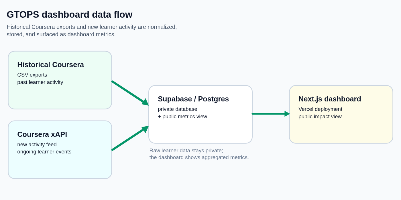
Coursera activity came from two paths. Historical activity was exported from Coursera dashboard reports as CSV files and imported into Supabase. New learner activity was handled through a Coursera xAPI receiver, which accepts incoming learning statements, normalizes the useful fields, and stores both the raw statement and selected reporting fields in the database.
Supabase stores the private learner and activity records. The public dashboard uses aggregated metrics and summary views so that the site can communicate program impact without exposing individual learner details.
What Made the Work Difficult
This was not just a design project. The dashboard needed to connect a real data source, preserve a path for future updates, and still be understandable to non-technical stakeholders.
The work involved:
- planning how historical Coursera exports and new activity should work together
- creating a Supabase schema for learners, progress, certifications, placements, alerts, metrics, and xAPI statements
- building API endpoints for Coursera xAPI authentication and statement ingestion
- writing import scripts for historical Coursera dashboard exports
- deciding which information should be public-facing and which should stay internal
- explaining the data flow clearly to project stakeholders
My Role
I worked across the product, data, and implementation layers of the project. I built the dashboard interface, connected it to Supabase, implemented the historical data import path, added the xAPI receiver, and documented the setup and deployment process.
I also used AI-assisted development tools during the project. Pi coding agent helped me inspect the codebase, draft and refine parts of the dashboard, reason through the data flow, and turn technical details into clearer summaries for advisors and stakeholders. I still reviewed, tested, and made the final implementation decisions.
Key Implementation Pieces
| Area | What I built |
|---|---|
| Front end | Next.js / TypeScript dashboard with Tailwind styling |
| Database | Supabase/Postgres schema with private tables and public summary metrics |
| Historical data | Import script for Coursera dashboard CSV exports |
| New activity | xAPI token endpoint and statement receiver |
| Deployment | Vercel production deployment with environment-based configuration |
| Documentation | Setup, xAPI receiver, Supabase, deployment, and backfill notes |
Deliverables
Download project files
This package includes the sanitized code and documentation that show the dashboard structure, Supabase schema, import scripts, xAPI receiver, and setup notes. Environment files, secrets, build folders, and raw Coursera exports are not included.
Tools Used
Next.js, TypeScript, Tailwind CSS, Supabase/Postgres, Vercel, Coursera xAPI, CSV imports, Node.js scripts, Row Level Security policies, Git, and Pi coding agent for AI-assisted development.
Why This Project Matters
The dashboard helps turn program activity into a clearer story. Instead of leaving impact data inside separate exports and technical systems, it gives GTOPS / EC4A a public-facing way to show learner participation, progress, completions, and grant-related goals.
It also creates a stronger base for future internal reporting, including skill progression, certification tracking, Central Texas participant reporting, and workforce placement metrics.
What I Would Change Next Time
The first version established the data flow and dashboard structure. A stronger next version would focus on product polish, validation, and internal workflow.
1. Separate Public and Internal Views Earlier
The project made it clear that different audiences need different levels of detail. I would design the public impact page and the internal operations page as separate experiences from the start.
2. Define Metrics Before Building Visuals
Some terms, such as activated learner, completion, certification, and placement, need shared definitions. I would confirm those definitions earlier so every dashboard number has a clear reporting meaning.
3. Add Time-Based Impact Charts
Static totals are useful, but progress over time tells a stronger story. I would add monthly or yearly charts for enrollment, completions, skill progression, and advanced certification goals.